
No-flash theme switch for Next.js
Light and dark mode that never flashes the wrong theme on load, remembers the choice and stays in step across tabs
How it works
- A tiny inline script in <head> sets data-theme on <html> before the first paint.
- Add suppressHydrationWarning to <html>, because that script changes it before React hydrates.
- The hook starts from the same value on the server and the client, so there is no hydration mismatch, then reads the real theme on mount.
- The choice is saved to localStorage, and a storage listener keeps every open tab in step. Toggle the demo and this page follows.
- Blocked storage never breaks switching, and ?capture forces Light for screenshots.
Source
/**
 * Runs in <head> before first paint so the saved theme never flashes.
 * `?capture` forces Light for deterministic screenshots and never touches the saved choice.
 * It also points the favicon <link> (rendered before this script) at the matching file in public/.
 */
export const themeStorageKey = "abbas-theme";
/** Bump when public/favicon-*.svg change, so browsers drop their cached icon. */
export const faviconVersion = "2";
export const faviconHref = (theme: "light" | "dark") => `/favicon-${theme}.svg?v=${faviconVersion}`;

export const themeInitScript = `(() => {
  const root = document.documentElement;
  const capture = new URLSearchParams(location.search).has("capture");
  if (capture) root.dataset.capture = "true";
  if (!capture && !matchMedia("(prefers-reduced-motion: reduce)").matches) root.classList.add("motion");
  try {
    root.dataset.theme = !capture && localStorage.getItem("${themeStorageKey}") === "dark" ? "dark" : "light";
  } catch {
    root.dataset.theme = "light";
  }
  document.querySelector('link[rel="icon"]')?.setAttribute("href", "/favicon-" + root.dataset.theme + ".svg?v=${faviconVersion}");
})();`;import { useEffect, useState } from "react";
import { faviconHref, themeStorageKey } from "./themeInit";
export type ThemeMode = "light" | "dark";
export function useTheme() {
// Server and first client render agree on Light; the real theme is already on <html> from themeInit.
const [theme, setTheme] = useState<ThemeMode | null>(null);
useEffect(() => {
setTheme(document.documentElement.dataset.theme === "dark" ? "dark" : "light");
}, []);
useEffect(() => {
if (!theme) return;
document.documentElement.dataset.theme = theme;
try { if (!new URLSearchParams(location.search).has("capture")) localStorage.setItem(themeStorageKey, theme); } catch { /* Theme still works when storage is unavailable. */ }
const color = getComputedStyle(document.documentElement).getPropertyValue("--surface-canvas").trim();
document.querySelector('meta[name="theme-color"]')?.setAttribute("content", color);
document.querySelector('link[rel="icon"]')?.setAttribute("href", faviconHref(theme));
}, [theme]);
useEffect(() => {
const sync = (event: StorageEvent) => {
if (event.key === themeStorageKey) setTheme(event.newValue === "dark" ? "dark" : "light");
};
window.addEventListener("storage", sync);
return () => window.removeEventListener("storage", sync);
}, []);
useEffect(() => {
// Keeps several toggles on one page (footer, demos) in step; re-setting the same value is a no-op.
const root = document.documentElement;
const observer = new MutationObserver(() => setTheme(root.dataset.theme === "dark" ? "dark" : "light"));
observer.observe(root, { attributes: true, attributeFilter: ["data-theme"] });
return () => observer.disconnect();
}, []);
return { theme: theme ?? "light", toggleTheme: () => setTheme(current => (current ?? "light") === "light" ? "dark" : "light") };
}import { Moon, Sun } from "@phosphor-icons/react";
import type { ThemeMode } from "../design/useTheme";
export function ThemeToggle({ theme, onToggle, variant = "icon" }: { theme: ThemeMode; onToggle: () => void; variant?: "icon" | "text" }) {
// The text variant lives in footers, beside links like "Back to top".
if (variant === "text") {
const Icon = theme === "light" ? Moon : Sun;
return <button type="button" className="theme-toggle-text" aria-pressed={theme === "dark"} onClick={onToggle}>
{theme === "light" ? "Dark mode" : "Light mode"} <Icon weight="bold" aria-hidden="true" />
</button>;
}
return <button type="button" className="theme-toggle" aria-label={theme === "light" ? "Switch to dark theme" : "Switch to light theme"} aria-pressed={theme === "dark"} onClick={onToggle}>
<svg viewBox="0 0 24 24" fill="none" stroke="currentColor" strokeWidth="1.5" aria-hidden="true">
{theme === "light" ? <path d="M20.9 13A9 9 0 0 1 11 3.1 9 9 0 1 0 20.9 13Z" /> : <><circle cx="12" cy="12" r="4" /><path d="M12 2v2m0 16v2M2 12h2m16 0h2M5 5l1.5 1.5m11 11L19 19M5 19l1.5-1.5m11-11L19 5" /></>}
</svg>
</button>;
}More from the Library

Variable weight headline
The headline rises in letter by letter, then each letter thins out as the cursor nears it, on the font's own weight axis
- React
Ink-to-render reveal
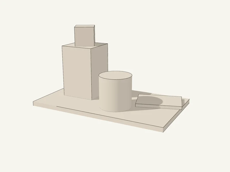
A 3D object draws itself in ink, shades in graphite, then turns into the real material. One progress value drives all three phases.
- Three.js
- React Three Fiber

